IELTS Academic Writing Task 1 Bar Topics 2024
This list contains a selection of IELTS Academic Writing Task 1 bar topics that were submitted by students who completed the IELTS exam in 2024. Select a topic at random and start practicing and enhancing your writing abilities.


bar
You should spend about 20 minutes on this task.
The chart below shows the different levels of post-school qualifications in Australia and the proportion of men and women who held them in 1999.
Summarise the information by selecting and reporting the main features and make comparisons where relevant.
Write at least 150 words.


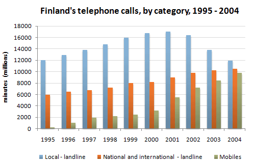
bar
The graph below shows the percentage of urban/suburban and rural households in a certain country that had Internet access between 2011 and 2016. Summarize1 the information by selecting and reporting the main features, and make comparisons where relevant. Household Internet Access 60% "'1'1'""-;::==============::::;----------2011 2012 2013 2014 2015 2016 Write at least 150 words.


bar
Task 1 Sample Questions and Band 9 Model Answers
For more information and help with your IELTS test visit- IELTSAdvantage.com
The graph above shows the stock price of four technology companies between 2011 and 2016.
Summarise the information by selecting and reporting the main features, and make comparisons where relevant.


bar
The bar chart provides an overview of electricity manufacture and utilised utilisation in ten countries in 2014.
Overall, the usage and production of electricity increased in nine countries whereas only Germany have decline in the trend. China and the United States were on the top of electricity output and use.
To begin with production, the maximum electricity was produced by China, which was 5398 billion kWh and it was followed by the USA at 4000. However, the least energy was generated by Korea, reported at 4851. Interestingly, power generation by the remaining countries ranged between 1000 and 500 billion Kw.
In case of consumption, the highest usage was in China with 5322 Kw, while the lowest was in Korea at 449.5 kwh. The usage in Canada, France and Brazil was almost similar around 450 kwh. However, the figures in Germany, India, Japan and Russia remained close to 1000 kwh and above 500 kWh.


bar
The chart below shows the proportion of profits made from the seven most viewed genres in US cinemas in 1995,2000 and 2005 as a percentage of total earnings of the US film industry for each year.
Summarise the information by selecting and reporting the main features, and make comparisons where relevant


🚀 Prepare for IELTS writing section today!
- Unlimited Task 1 checksGet all the feedback you need to keep improving your charts and letters.
- Unlimited Task 2 checksPractice and perfect your skills with essays.
- Personalized suggestionsKnow how to boost your score.
- Detailed mistakes analysisGet instant feedback. Spot every mistake.
- Topic ideas generatorGet topic-specific ideas to enhance your writing.
- Vocabulary helperGet the right words for any topic.
- Progress trackingTrack your writing improvements.