IELTS Academic Writing Task 1 Multiple Topics 2024
This list contains a selection of IELTS Academic Writing Task 1 multiple topics that were submitted by students who completed the IELTS exam in 2024. Select a topic at random and start practicing and enhancing your writing abilities.


multiple
The line graph shows the number of books that were borrowed in four different months in 2014 from four village libraries, and the pie chart shows the percentage of books, by type, that were borrowed over this time.
Summarize the information by selecting and reporting the main features and make comparisons where relevant.


multiple
The table below shows how young people in Tokyo, Japan, listened to music over the previous month. The pie chart shows a record company's international findings about whether people preferred live or recorded music.
Summarize the information by selecting and reporting the main features, and make comparisons where relevant.


multiple
The table below shows the numbers of visitors to Ashdown Museum during the year before and the year after it was refurbished. The charts show the results of surveys asking visitors how satisfied they were with their visit, during the same to periods. Summarise the information by selecting and reporting the main features, and make comparisons where relevant.


multiple
The charts below show the percentage of their food budget the average family spent on restaurant meals in different years. The graph shows the average number of meals eaten in fast-food restaurants and sit-down restaurants per family. Summarize1 the information by selecting and reporting the main features, and make compari sons where relevant. Write at least 150 words.


multiple
You should spend about 20 minutes on this task.
The first chart below shows the results of a survey which sampled a cross-section of 100,000 people asking if they traveled abroad and why they traveled for the period 1994-98.
The second chart shows their destinations over the same period.
Write a report for a university lecturer describing the information shown below
You should write at least 150 words.


multiple
The table below gives information on UK acid rain emissions, measured in millions of tonnes, from four different sectors between 1990 and 2007. Write a report for a university lecturer describing the information shown below. Make comparisons where relevant.
UK acid rain emissions, measured in millions of tonnes, from four different sectors between 1990 and 2007


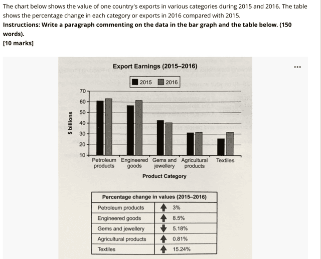
multiple
The chart below shows the value of one country's exports in various categories during 2015 and 2016. The table shows the percentage change in each category of experts in 2016 compared with 2015.
Summarise the information by selecting and reporting the main features, and make comparisons where relevant.


multiple
The table below shows the estimated oil capacity of six countries, in millions of barrels per day, from 1990 to 2010.
Summarise the information by selecting and reporting the main features, and make comparisons where relevant.
You should spend about 20 minutes on this task.
Write at least 150 Words.


multiple
the table and charts below give information on the police budget for 2017 and 2018 in one area of Britain. The table shows where the money came from and charts show how it was distributed.
summerise the information by selecting and reporting the main features, and make comparisons where relevant.


multiple
The table below shows the projected costing over the next five years in american dollar for three environmental projects for sustainable foresty. the pie chart shows the expected expenditure brealdown allocation for the year as the projects are set up. Summerize the information by selecting and reporting the main features and male comparisons whre relevent


multiple
The graph below depicts the demand for electricity in England during typical days in winter and summer. The pie charts below shows how electricity is used in an average home in the same country.
Summarize the information by selecting and reporting the main features,and make cmparison where relevant.


multiple
The pie charts illustrate the proportion of people arrested in the UK by gender between 2015 and 2020 and the bar graph demonstrates the different categories for their arrests. Overall, a larger share of males were arrested than females and public intoxication was the most common reason for both sexes.
multiple
The charts below show the results of a survey of adult education. The first chart
shows the reasons why adults decide to study. The pie chart shows how people
think the costs of adult education should be shared.
Write a report for a university lecturer, describing the information shown below.

multiple
The table below shows CO2 emissions for different forms of transport in the European Union. The Pie Chart shows the percentage of European Union funds being spent on different forms of transport.
Write a report for a university lecturer describing the information shown below.
CO2 emissions per passenger kilometre
co2 emissions
EU Funds for transport 2007-2013
eu funds for transport
written by: ata bitaraf


multiple
You should spend about 20 minutes on this task.
The table shows the percentage of journeys made by different forms of transport in four countries, The bar graph shows the results of a survey into car use.
Summarise the information by selecting and reporting the main features, and make comparisons where relevant.
Write at least 150 words.


multiple
the given table illustrates the forecasted costing over the next five years in American dollar for three three environmental project for sustainable foresty and the pie chart depicts anticipated expenditure breakdown allocation for the first year. the information by selecting and reporting the main features and make comparisons were relavant.


🚀 Prepare for IELTS writing section today!
- Unlimited Task 1 checksGet all the feedback you need to keep improving your charts and letters.
- Unlimited Task 2 checksPractice and perfect your skills with essays.
- Personalized suggestionsKnow how to boost your score.
- Detailed mistakes analysisGet instant feedback. Spot every mistake.
- Topic ideas generatorGet topic-specific ideas to enhance your writing.
- Vocabulary helperGet the right words for any topic.
- Progress trackingTrack your writing improvements.