IELTS Academic Writing Task 1 Pie Topics 2024
This list contains a selection of IELTS Academic Writing Task 1 pie topics that were submitted by students who completed the IELTS exam in 2024. Select a topic at random and start practicing and enhancing your writing abilities.


pie
The pie charts compare the proportion of water consumption for industry,
agriculture, and domestic purpose in six separate regions of the world.
Overall, it is clear that water used for agriculture accounts for the largest
proportion, except for North America and Europe, mainly providing for
industrial use.
With regard to agricultural use, Central Asia is the area that uses the greatest
level of water, at exactly 88%, followed by the figure for Africa and South
East Asia, at 84% and 81% respectively. South America needs a smaller rate,
with 71%, compared to one-third of the total consumption in Europe.
In contrast, Europe area primarily uses water for industry, making up the
highest percentage among the remaining regions, over a half of the total.
Likewise, 48% of water is prioritized this purpose in North America,
contrasting to 10% of that in South America. A noticeable pattern is that all
six areas use an inconsiderable percentage of water for domestic purpose,
apart from South America, with 19%, being the most significant consumption
level.


pie
Imagine that you are doing a project on the ways of communication prefersed by Zetland teenagers. You have found some data on the subject - the results of the opinion polls (see the pie chart below).
Comment on the data in the pie chart and give your opinion on the subject of the project.
The ways of communication preferred by Zetland teenagers
7%
10%
36%
20%
Speaking on the phone
Talking in person
89 Texting
Va Sending emails
Sending voice messages
27%
Write 200-250 words.
Use the following plan:
- make an opening statement on the subject of the project;
- select and report 2-3 facts;
make 1-2 comparisons where relevant and give your comments;
- outline a problem that can arise with communication through technical and suggest a way of solving it;
- conclude by giving and explaining your opinion on the importance of commun in person.


pie
Writing Task 1 (Pie.
The charts below show the percentage of water used for different purposes in six areas of the world.
Summarise the information by selecting and reporting the main features and make comparisons where relevant.
39%
19%
48%
13%
71%
53%
North America
South America
Europe
Africa
84%
32%
15%
Central Asia
South East Asia
Industrial Use
Agricultural Use 100% +
Domestic Use


pie
Writing Task 1
You should spend about 20 minutes on this task.
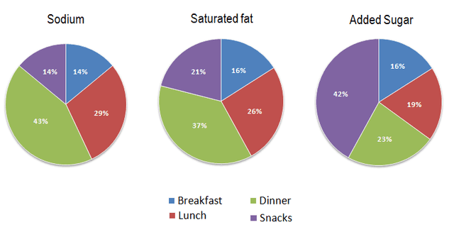
The charts below show the average percentages in typical meals of three types of nutrients, all of which may be unhealthy if eaten too much.
Summarize the information by selecting and reporting the main features, and make comparisons where relevant.
Write at least 150 words.


pie
The chart shows the results of surveys in one African country asking teenagers the main reasons for using their phones between 2016 and 2019.
Summarise the information by selecting and reporting the main features, and make comparisons where relevant.
You should spend about 20 minutes on this task.


pie
The charts below show degrees granted in different fields at the National University in the years 1990, 2000, and 2010.
Summarise the information by selecting and reporting the main features, and make comparisons where relevant. You should write at least 150 words.
Degrees Granted at the National University.


🚀 Prepare for IELTS writing section today!
- Unlimited Task 1 checksGet all the feedback you need to keep improving your charts and letters.
- Unlimited Task 2 checksPractice and perfect your skills with essays.
- Personalized suggestionsKnow how to boost your score.
- Detailed mistakes analysisGet instant feedback. Spot every mistake.
- Topic ideas generatorGet topic-specific ideas to enhance your writing.
- Vocabulary helperGet the right words for any topic.
- Progress trackingTrack your writing improvements.