IELTS Academic Writing Task 1 Unknown Topics 2024
This list contains a selection of IELTS Academic Writing Task 1 unknown topics that were submitted by students who completed the IELTS exam in 2024. Select a topic at random and start practicing and enhancing your writing abilities.


unknown
You should spend about 20 minutes on this task.
The graph below shows the percentage of people going to cinemas in one European country on different days.
Summarize the information by selecting and reporting the main features and make comparisons where relevant.
You should write at least 150 words.


unknown
You should spend about 20 minutes on this task.
The graph below shows the proportion of the population aged 65 and over between 1940 and 2040 in three different countries.
Summarize the information by selecting and reporting the main features and make comparisons where relevant.
You should write at least 150 words.


unknown
The chart below shows the expenditure on three categories among different age groups of residents in the UK in 2004.
The chart below shows the expenditure on three categories amongSummarise the information by selecting and reporting the main features, and make comparisons where relevant. Write at least 150 words.


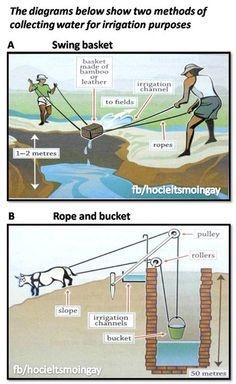
unknown
You should spend about 20 minutes on this task.
The diagrams below show how houses can be protected in areas which are prone to flooding.
Write a report for a university, lecturer describing the information shown below.
Summarise the information by selecting and reporting the main features and make comparisons where relevant.
You should write at least 150 words.


🚀 Prepare for IELTS writing section today!
- Unlimited Task 1 checksGet all the feedback you need to keep improving your charts and letters.
- Unlimited Task 2 checksPractice and perfect your skills with essays.
- Personalized suggestionsKnow how to boost your score.
- Detailed mistakes analysisGet instant feedback. Spot every mistake.
- Topic ideas generatorGet topic-specific ideas to enhance your writing.
- Vocabulary helperGet the right words for any topic.
- Progress trackingTrack your writing improvements.