The graph below gives information about internet users in three countries between 1999 and 2009. Write a report for a university lecturer describing the information shown below. Make comparisons where relevant.

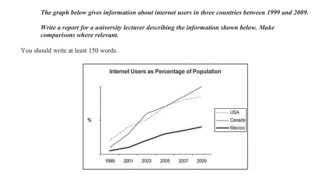
The line graph compares the proportion of people using
internet
to the total Add an article
the internet
people
living in three distinct nations, namely the USS, Canada, Correct quantifier usage
number of people
Mexico
, between 1999 and 2009. Correct word choice
and Mexico
Overall
, all of the statistical data from the nations combined indicated an upward trend with various variations at that period. Originally, the figures were 0%, 10%, and 25%, in that order. But towards the end, they were 50%, 90%, and 100%, respectively.
The USA ranked first among the others. Unfortunately, they were surpassed by Canada since the number of Americans browsing online was lower than that of Canadians in 2003. However
, those two lines overlapped at 20% in 2005 and after that
the gaps returned and grew larger.
The figure of online users in Mexico consistently lagged behind other nations since they came in lowest. The reason for their place remaining unchanged for the first to the Add a comma
that,
last
session was their slight increase in changesSubmitted by msdedew10 on
Unauthorized use and/or duplication of this material without express and written permission from this site’s author and/or owner is strictly prohibited. Excerpts and links may be used, provided that full and clear credit is given to Writing9 with appropriate and specific direction to the original content.
Vocabulary: The word "figures" was used 2 times.
▼