Writing Task 1 (From Cambridge IELTS Book 10, test 1) You should spend about 20 minutes on this task. The first chart below shows how energy is used in an average Australian household. The second chart shows the greenhouse gas emissions which result from this energy use. Summarise the information by selecting and reporting the main features, and make comparisons where relevant. Write at least 150 words Writing Task 1 (From Cambridge IELTS Book 10, test 1) You should spend about 20 minutes on this task. The first chart below shows how energy is used in an average Australian household. The second chart shows the greenhouse gas emissions which result from this energy use. Summarise the information by selecting and reporting the main features, and make comparisons where relevant. Write at least 150 words

#cambridge #ielts #book #test #minutes #first #energy #australian #household #second #greenhouse #gas #emissions #summarise #information #features #comparisons
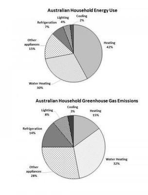
A glance at the former pie chart provided reveals the portions of the energy usage of household
appliances
namely heating, water heating, refrigeration, other appliances
, lighting as well as
cooling in an average Australian family. The latter graph depicts how much these devices emit greenhouse gases.
Overall
, what stands out from the graphs is that heating and water purposes account for the highest amount of both energy utilization and gas emissions among all, whereas
lighting and cooling make up the lower shares.
Looking into detail, the first pie chart shows that 42% of power consumption is heating and which is followed by water heating together with
other appliances
are in the middle per cent of 30 and 15 respectively. Lastly
, refrigeration, lighting as well as
cooling have the lowest proportion.
Besides
, the second graph illustrates the percentage of greenhouse gas emissions that belong to the consequences of a variety of home electronic machines. One noticeable fact is other appliances
produce more carbon dioxide than their usage by 13 per cent also
emissions of refrigeration doubled to 14 per cent. Even though heating
is the largest shareholder, its gas generation is Add an article
the heating
significant
low.Change the adjective
significantly
Submitted by Nz
on
Unauthorized use and/or duplication of this material without express and written permission from this site’s author and/or owner is strictly prohibited. Excerpts and links may be used, provided that full and clear credit is given to Writing9 with appropriate and specific direction to the original content.
Linking words: Don't use the same linking words: "as well as".
▼
Vocabulary: Replace the words appliances with synonyms.
▼
Vocabulary: The word "chart" was used 2 times.
▼
Vocabulary: The word "graph" was used 3 times.
▼