IELTS Academic Writing Task 1 Bar Topics 2024
This list contains a selection of IELTS Academic Writing Task 1 bar topics that were submitted by students who completed the IELTS exam in 2024. Select a topic at random and start practicing and enhancing your writing abilities.


bar
You should spend about 20 minutes on this task.
The bar graph shows the global sales (in billions of dollars) of different types of digital games between 2000 and 2006.
Write a report for a university, lecturer describing the information shown below.
Summarise the information by selecting and reporting the main features and make comparisons where relevant.
You should write at least 150 words.


bar
Part 1
You should spend about 20 minutes on this task. Write at least 150 words.
The bar chart below shows the percentage of Australian men and women in different age groups who did regular physical activity in 2010.
Summarise the information by selecting and reporting the main features, and make comparisons where relevant
Percentage of Australian men and women doing regular physical activity: 2010


bar
The chart below shows the results of three surveys on absenteeism in a particular European country in the years 2000, 2005 and 2010. The results show the reasons people gave for not going to work.
Summarise the information by selecting and reporting the main features, and make comparisons where relevant.


bar
A bar chart shows the percentage of men and women in Great Britain who had driving licenses and another bar chart shows the percentage of men and women who applied for driving licenses at the age of 17-20. Summarize the information by selecting and reporting the main features and make comparisons where relevant.


bar
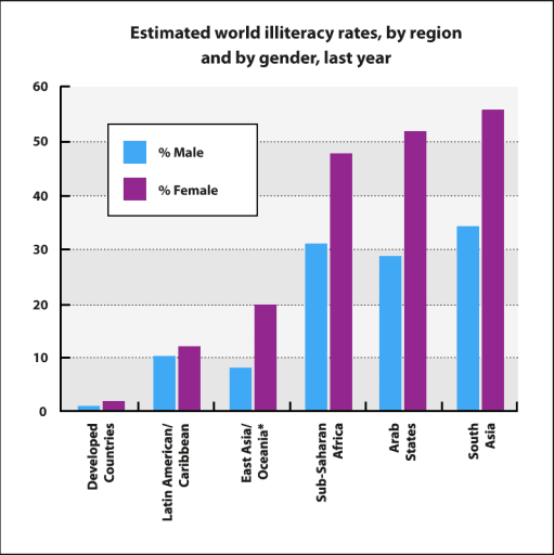
You should spend about 20 minutes on this task.
The bar chart below shows estimated world illiteracy rates by region and by gender for the last year.
Summarise the information by selecting and reporting the main features, and make comparisons where relevant.
You should write at least 150 words.
Estimated world illiteracy rates, by region and by gender, last year


bar
The bar chart shows the distribution of YouTube users worldwide as of January 2023 by age group.
Summarize the information by selecting and reporting the main features, and make comparisons where relevant.
The bar chart shows the distribution of YouTube users worldwide as of January 2023 by age group.
Summarize the information by selecting and reporting the main features, and make comparisons where relevant.


bar
The charts below show the number of Japanese tourists travelling abroad between 1985 and 1995 and Australia’s share of the Japanese tourist market.
Write a report for a university lecturer describing the information shown below.
The charts below show the number of Japanese tourists travelling abroad between 1985 and 1995 and Australia’s share of the Japanese tourist market.
Write a report for a university lecturer describing the information shown below.


🚀 Prepare for IELTS writing section today!
- Unlimited Task 1 checksGet all the feedback you need to keep improving your charts and letters.
- Unlimited Task 2 checksPractice and perfect your skills with essays.
- Personalized suggestionsKnow how to boost your score.
- Detailed mistakes analysisGet instant feedback. Spot every mistake.
- Topic ideas generatorGet topic-specific ideas to enhance your writing.
- Vocabulary helperGet the right words for any topic.
- Progress trackingTrack your writing improvements.