IELTS Academic Writing Task 1 Pie Topics 2024
This list contains a selection of IELTS Academic Writing Task 1 pie topics that were submitted by students who completed the IELTS exam in 2024. Select a topic at random and start practicing and enhancing your writing abilities.


pie
WRITING TASK 1
You should spend about 20 minutes on this task
The following two pie charts show the results of a survey into the popularity of various
leisure activities among European adults in 1985 and 1995.
Summarise the information by selecting and reporting the main features, and make
comparisons where relevant.
Write at least 150 words.


pie
You should spend about 20 minutes on this task.
The pie charts below give data on the spending and consumption of resources by countries of the world and how the population is distributed.
Summarize the information by selecting and reporting the main features, and make comparisons where relevant.
You should write at least 150 words.


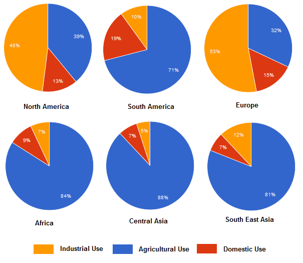
pie
Writing Task 1 (Pie.
The charts below show the percentage of water used for different purposes in six areas of the world.
Summarise the information by selecting and reporting the main features and make comparisons where relevant.
39%
19%
48%
13%
71%
53%
North America
South America
Europe
Africa
84%
32%
15%
Central Asia
South East Asia
Industrial Use
Agricultural Use 100% +
Domestic Use


pie
The diagrams below show UK students' responses to the question of to what extent would they describe themselves as financially organized.
Summarize the information by selecting and reporting the main features, and make comparisons where relevant.
Write at least 150 words.
Very organised %
All students 21
Age up to 22 years 18
Age 23-25 years 26
Age over 26 years 35


pie
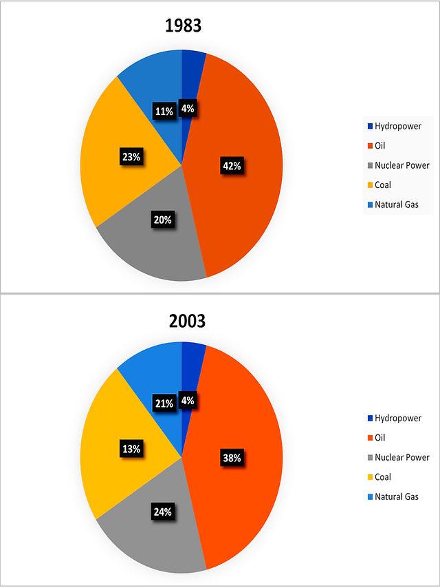
The pie charts compare the proportion of water consumption for industry,
agriculture, and domestic purpose in six separate regions of the world.
Overall, it is clear that water used for agriculture accounts for the largest
proportion, except for North America and Europe, mainly providing for
industrial use.
With regard to agricultural use, Central Asia is the area that uses the greatest
level of water, at exactly 88%, followed by the figure for Africa and South
East Asia, at 84% and 81% respectively. South America needs a smaller rate,
with 71%, compared to one-third of the total consumption in Europe.
In contrast, Europe area primarily uses water for industry, making up the
highest percentage among the remaining regions, over a half of the total.
Likewise, 48% of water is prioritized this purpose in North America,
contrasting to 10% of that in South America. A noticeable pattern is that all
six areas use an inconsiderable percentage of water for domestic purpose,
apart from South America, with 19%, being the most significant consumption
level.


pie
The charts below show the results of a questionnaire that asked visitors to the Parkway Hotel how they rated the hotel's customer service. The same questionnaire was given to 100 guests in the years 2005 and 2010.
Summarise the information by selecting and reporting the main features and make comparisons where relevant.
You should write at least 150 words.


🚀 Prepare for IELTS writing section today!
- Unlimited Task 1 checksGet all the feedback you need to keep improving your charts and letters.
- Unlimited Task 2 checksPractice and perfect your skills with essays.
- Personalized suggestionsKnow how to boost your score.
- Detailed mistakes analysisGet instant feedback. Spot every mistake.
- Topic ideas generatorGet topic-specific ideas to enhance your writing.
- Vocabulary helperGet the right words for any topic.
- Progress trackingTrack your writing improvements.