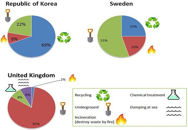
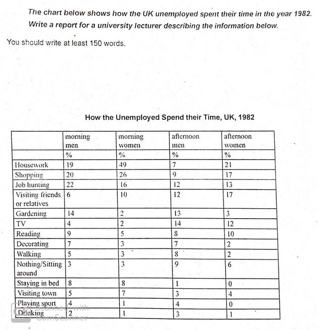
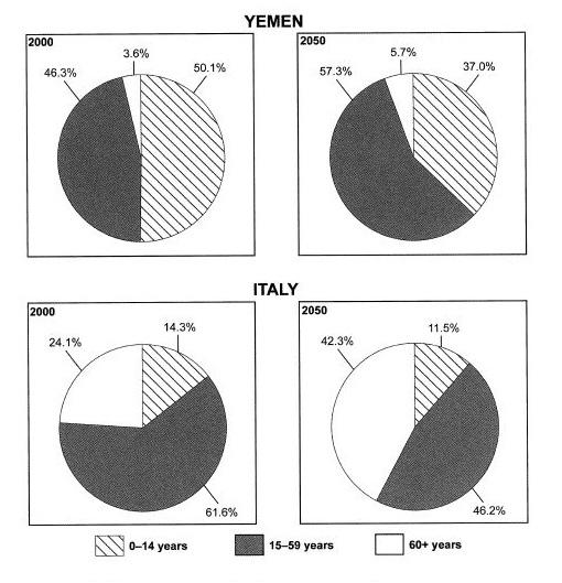
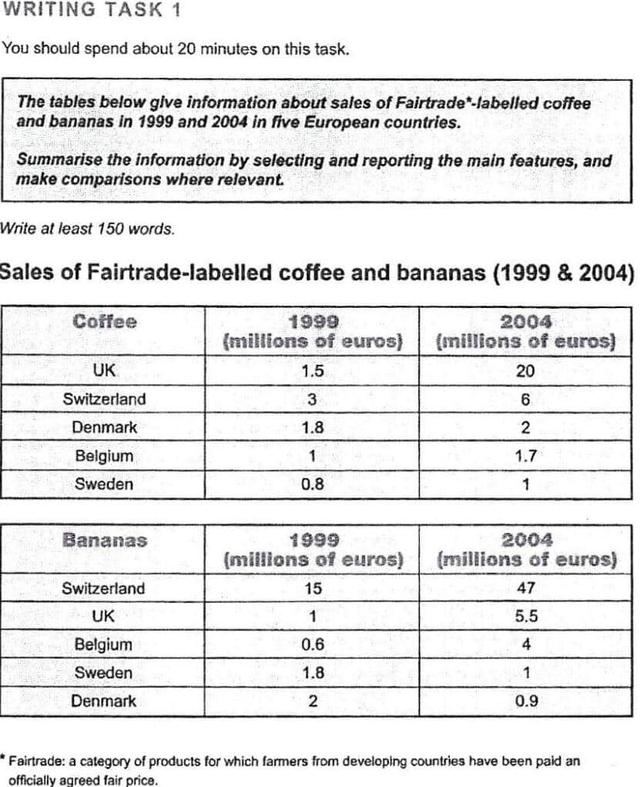
IELTS Academic Writing Task 1 Topics May & June 2024

Get a band score and detailed report instantly. Check your IELTS essays right now!

The collection of the recent IELTS Academic Writing Topics is a compilation of topics which have been recently used in IELTS Academic Writing Task 1. These topics cover a wide range of topics, from everyday topics such as shopping and leisure activities to more complex topics such as healthcare, economics, and technology. The topics are chosen from past IELTS exams and reflect the kinds of topics students may be asked to write about in their upcoming IELTS exam. The Collection of the recent IELTS Academic Writing Topics provides students with useful practice material to help them prepare for the IELTS exam.

Choose one of the topics and practice your writing skills daily. If you are having difficulty coming up with your own topic ideas, simply click the "Show Answers" button and you will be presented with a range of possible topics.

It is clear from the graph that the ratio of smoking men were the highest over the period given, while the women were the lowest in general.

The chart below gives information about the percentage of male and female teacher in six different kind of education setting in UK in 2010.

The three pie charts illustrate how many hours in a British university library are spent by undergraduates and postgraduates compared to other students.
The three pie charts illustrate how many hours  in a British university library  are spent by undergraduates and postgraduates compared to other students.

The charts shows the performance of sector wise indices in india from 2008 to 2018.

1.The two graphs below show the percentage of smokers and the consumption of alcohol in litres in selected countries, for the period 1960-2000. Summarize the information by choosing and reporting the key features, and make any relevant comparisons.
1.The two graphs below show the percentage of smokers and the consumption of alcohol in litres in selected countries, for the period 1960-2000.

Summarize the information by choosing and reporting the key features, and make any relevant comparisons.

The chart below shows the expenditure on three categories among UK residents in 2004. Summarize the information by selecting and reporting the main features, and make comparisons where relevant.
The chart below shows the expenditure on three categories

among UK residents in 2004. Summarize the information by selecting and reporting the main features, and make comparisons where relevant.

The charts show the proportion of holidaymakers of one region staying in different types of accommodation in three different years.

The chart below shows the total number of minutes (in millions) of telephone calls in Finland, divided into three categories, from 1995 – 2004.

4.The graph below shows the number of overseas visitors who came to Japan for differen purposes between 1990 and 2010.Summarize the information by selecting and reporting the main features, and make comparisons where relevant

the table below shows stastistics about the top five countries for international tourism in 2012 and 2013.

The graph below shows the wheat exports in three countries during the year 1985-1990 in millions of tonnes. Summarize the information by selecting and reporting the main features, and make comparisons where relevant.
The graph below shows the wheat exports in three countries during the year 1985-1990 in millions of tonnes.

Summarize the information by selecting and reporting the main features, and make comparisons where relevant.

The maps show the changes of Nelson city between 2000 and now.

The pie charts below show how dangerous waste products are dealt with in three countries. Summarise the information and Write at least 150 words.
The pie charts below show how dangerous waste products are dealt with in three countries.

Summarise the information and Write at least 150 words.

The pie charts compare ways of accessing the news in Canada and Australia

The table below shows how the UK unemployed spent their time last year. Summarise the information by selecting and reporting the main features, and make comparisons where relevant. You should spend about 20 minutes on this task. Write at least 150 words.
The table below shows how the UK unemployed spent their time last year.

Summarise the information by selecting and reporting the main features, and make comparisons where relevant.

You should spend about 20 minutes on this task. Write at least 150 words.

These pie charts show population data for two countries – Yemen and Italy. On the left, the pie charts show the nations’ demographics in 2000, and on the right they show projected figures for 2050. Both countries are estimated to undergo major changes in the age of their population. In 2000, slightly over half of Yemeni people are in the youngest age group, which is less than fourteen years old. A little less than half are aged between fifteen and fifty-nine years old, and the remaining 3.6% of the population is sixty years old or more. However, it is projected that in 2050 the percentage of the population aged below fourteen years will decline while the other two groups increase. There will be only 37% of the population aged less than fourteen years, while the percentage aged fifteen to fifty-nine will grow to 57.3%. Italy will follow a similar trend. Its youth population will decline from 14.3% to 11.5% while the number of elderly people nearly doubles. However, whereas in Yemen the group of people aged fifteen to fifty-nine grew, in Italy it will be somewhat reduced from nearly two thirds to less than a half of the total population.
These pie charts show population data for two countries – Yemen and Italy. On the left, the pie charts show the nations’ demographics in 2000, and on the right they show projected figures for 2050. Both countries are estimated to undergo major changes in the age of their population.

In 2000, slightly over half of Yemeni people are in the youngest age group, which is less than fourteen years old. A little less than half are aged between fifteen and fifty-nine years old, and the remaining 3.6% of the population is sixty years old or more. However, it is projected that in 2050 the percentage of the population aged below fourteen years will decline while the other two groups increase. There will be only 37% of the population aged less than fourteen years, while the percentage aged fifteen to fifty-nine will grow to 57.3%.

Italy will follow a similar trend. Its youth population will decline from 14.3% to 11.5% while the number of elderly people nearly doubles. However, whereas in Yemen the group of people aged fifteen to fifty-nine grew, in Italy it will be somewhat reduced from nearly two thirds to less than a half of the total population.

The tables below give information about sales of Fairtrade-labelled coffee and bananas in 1999 and 2004 in five European countries. Summary the information by selecting and reporting the main features and make comparisons where relevant.

The pie charts represent 6 different regions that utilized water for industrial, agricultural and domestic purposes.

The chart below give information about level of education in Glasgow,a city in Scotland, in 2010.

You should spend about 20 minutes on this task. The bar chart gives information about the number of car journeys into the city centre made by residents and non-residents. Summarise the information by selecting and reporting the main features, and make comparisons where relevant. Write at least 150 words.
You should spend about 20 minutes on this task.

The bar chart gives information about the number of car journeys into the city centre made by residents and non-residents.

Summarise the information by selecting and reporting the main features, and make comparisons where relevant.

Write at least 150 words.

The graphs below give information about computer ownership as a percentage of the population between 2002 and 2010, and by level of education for the years 2002 and 2010. Summarise the information by selecting and reporting the main features, and make comparisons where relevant.
The graphs below give information about computer ownership as a percentage of the population between 2002 and 2010, and by level of education for the years 2002 and 2010.

Summarise the information by selecting and reporting the main features, and make comparisons where relevant.

The graph below gives information about international tourist arrivals in different parts of the world. Summarise the information by selecting and reporting the main features, and make comparisons where relevant.
The graph below gives information about international tourist arrivals in different parts of the world.

Summarise the information by selecting and reporting the main features, and make comparisons where relevant.

The table below shows social and economic indictators for four countries in 1994, according to United Nations Statistics.

The first chart shows the population of England and Wales between 1700 and 2000. The second chart gives information about the birth and death rate in the same countried in the same period.

The graph illustrates how crime rates altered in Panama City during the period 2010-2019. We can see immediately that the greatest change occurred in the number of burglaries, while incidents of theft remained low but steady.

You should spend about 20 minutes on this task. The charts below show the percentage of total spending on four different categories by students in a European country from 1985 to 2015. Summaries the information by selecting and reporting the main features, and make comparisons where relevant. Write at least 150 words.
You should spend about 20 minutes on this task.


The charts below show the percentage of total spending on four different categories by students in a European country from 1985 to 2015.


Summaries the information by selecting and reporting the main features, and make comparisons where relevant.


Write at least 150 words.

The graph below shows relative price changes for fresh fruits and vegetables, sugars and sweets, and carbonated drinks between 1978 and 2009.

The pie chart below shows the amount of money that a chldren's charity located in the USA spent and received in one year

This chart gives information about the number of people who play video games on a computer or device. Summarise the information by reporting the main features and making relevant comparisons. (Around 150 words)

The diagram below shows the life cycle of a species of large fish called the salmon. Summarise the information by selecting and reporting the main features and make comparison where relevant.

The graph shows the consuption of three spreads from 1981 to 2007, Summarize the information by selecting and reporting the main features and make comparisons where relevant. Write at least 150 words.
The graph shows the consuption of three spreads from 1981 to 2007, Summarize the information by selecting and reporting the main features and make comparisons where relevant.

Write at least 150 words.

The graph below shows the amount of money spent on books in Germany, France, Italy and Austria between 1995 and 2005. Summarise the information by selecting and reporting the main features, and make comparisons where relevant. The line graph shows how much was spent in US dollars on books in four European countries between 1995 and 2005. Overall, people in Germany spent the most on reading materials during the entire period. It is also clear that despite some fluctuations, spending on books increased in all four places over the 10 years. German expenditure fluctuated between around $80 million and about $90 million between 1995 and 2003 before increasing to just under $100 million in 2005. France was the only country that experienced a steady rise, with around $55 million worth of books sold in 1995, about $70 million in 2001, and finally just under $80 million in 2005. The figure for Italy hovered at around $50 million dollars until 1999, when it steadily rose to just over $60 million in 2005. Austrians spent approximately $30 million in 1995, and this went up by around $10 million over the next four years and remained stable for two years, before it climbed dramatically to just above $70 million in 2005.
The graph below shows the amount of money spent on books in Germany, France, Italy and Austria between 1995 and 2005.

Summarise the information by selecting and reporting the main features, and make comparisons where relevant.

The line graph shows how much was spent in US dollars on books in four European countries between 1995 and 2005.

Overall, people in Germany spent the most on reading materials during the entire period. It is also clear that despite some fluctuations, spending on books increased in all four places over the 10 years.

German expenditure fluctuated between around $80 million and about $90 million between 1995 and 2003 before increasing to just under $100 million in 2005. France was the only country that experienced a steady rise, with around $55 million worth of books sold in 1995, about $70 million in 2001, and finally just under $80 million in 2005.

The figure for Italy hovered at around $50 million dollars until 1999, when it steadily rose to just over $60 million in 2005. Austrians spent approximately $30 million in 1995, and this went up by around $10 million over the next four years and remained stable for two years, before it climbed dramatically to just above $70 million in 2005.

The charts below show one government's spending on culture and education in 1995 and 2005 and the number of people participating in Arts events in the same years. Summarise the information by selecting and reporting the main features, and make comparisons where relevant.
The charts below show one government's spending on culture and education in 1995 and

2005 and the number of people participating in Arts events in the same years.

Summarise the information by selecting and reporting the main features, and make

comparisons where relevant.

The bar chart compares the proportion of boys and girls who participated in various sports in the year 2002

The bar chart below shows Scotland’s exports to the rest of the UK and the rest of the world for the year 2014. Summarize the information by selecting and reporting the main features and make comparisons where necessary.

The line graph shows the proportion of students aged 18-25 studying in the universities of Singapore, Malaysia, Philippines and Thailand from 1961 and 2011. Summarise the information by selecting and reporting the main features, and make comparisons where relevant.

The chart below shows the value of one countries exports in various categories during 2015 in 2016. The table shows the percentage change in each category of exports in 2016 compared with 2015.

The chart below gives information on the global sale of hybrid vehicles between 2006 and 2009 in Japan, the USA and other countries.

The charts below show the percentage of their food budget the average family spent on restaurant meals in different years. The graph shows the number of meals eaten in fast food restaurants and sit-down restaurants. Summarise the information by selecting and reporting the main features, and make comparisons where relevant.

The bar chart shows how many tourists visit four different museums in London over a five month period from June to October.

The diagram below shows the stages involved in producing one bottle of wine.

The following charts show the percentage of electricity production by fuel source in France in two years. Report the main features and make comparisons where relevant.

The table shows the percentage of government spending on education and training and the participation of 18-24 year olds in five countries in 2012.

The table data below shows the top ten Internet users by country in 2016.

The table below provide information on rental charges and salaries in three areas of London.

The pie charts indicate changes in the proportions of energy produced in a country from 1983 to 2003.

the charts below show the percentage of water used for different purposes in six areas of the world

The graph below gives information about U.S. government spending on research between 1980 and 2008. Summarise the information by selecting and reporting the main features, and make comparisons where relevant.
The graph below gives information about U.S. government spending on research between 1980 and 2008.

Summarise the information by selecting and reporting the main features, and make comparisons where relevant.

The diagrams below show the stages and equipment used in the cement making process, and how cement is used to produce concrete for building purposes. Summarise the information by selecting and reporting the main features, and make comparisons where relevant.
The diagrams below show the stages and

equipment used in the cement making process,

and how cement is used to produce concrete for

building purposes.

Summarise the information by selecting and

reporting the main features, and make

comparisons where relevant.

Two maps show the change of a coastal town called Pentland, from 1950 to 2007. Summarise the information by selecting and reporting the main features, and make comparisons where relevant.
Two maps show the change of a coastal town called Pentland, from 1950 to 2007.

Summarise the information by selecting and reporting the main features, and make comparisons where relevant.

🚀 Prepare for IELTS writing section today!
  • Unlimited Task 1 checks
    Get all the feedback you need to keep improving your charts and letters.
  • Unlimited Task 2 checks
    Practice and perfect your skills with essays.
  • Personalized suggestions
    Know how to boost your score.
  • Detailed mistakes analysis
    Get instant feedback. Spot every mistake.
  • Topic ideas generator
    Get topic-specific ideas to enhance your writing.
  • Vocabulary helper
    Get the right words for any topic.
  • Progress tracking
    Track your writing improvements.