IELTS Academic Writing Task 1
IELTS Academic Writing Task 1 Samples
Prepare for the IELTS Academic Test by using this collection of IELTS Academic Writing Task 1 practice samples. This collection is a great way to gain insight and practice for the exam.
The charts above represent how much increase the number of citizens of the biggest cities of our planet (New York, Tokyo, Shanghai, Bombay, and Jakarta) from 1970 to 2015. Also, these sources compare the correlation between rural and urban society in comparison with time flowing.

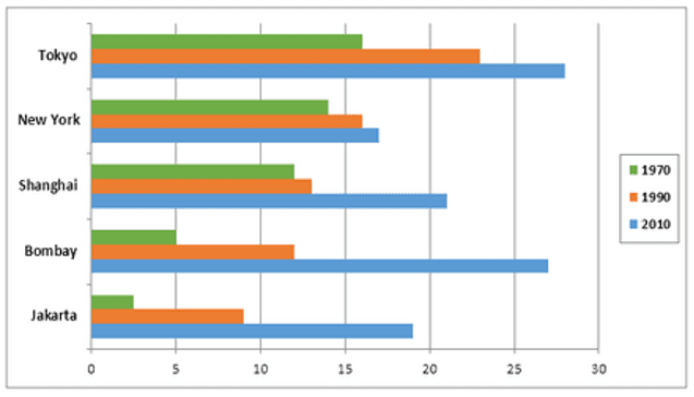
The charts above represent how much increase the number of citizens of the biggest cities of our planet (New York, Tokyo, Shanghai, Bombay, and Jakarta) from 1970 to 2015. Also, these sources illustrate the correlation between rural and urban society in comparison with time flowing.

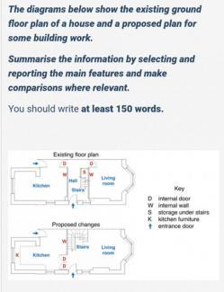
The diagram illustrates information regarding the ground floor plan of a house and a proposed plan for some building work.

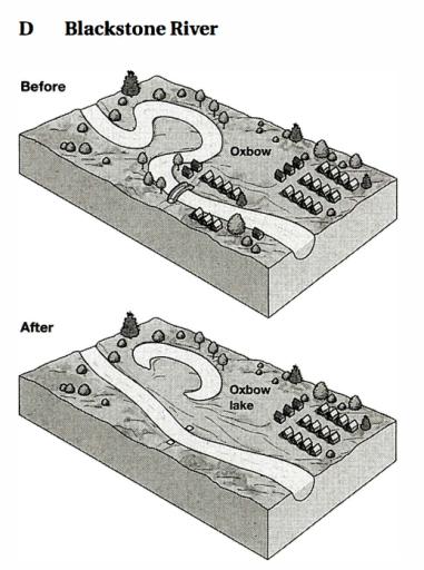
The diagram depicts a territory around the Blackstone river prior to and following a flood. Looking from an overall perspective, it is readily apparent that many things were washed away by the floodwaters.

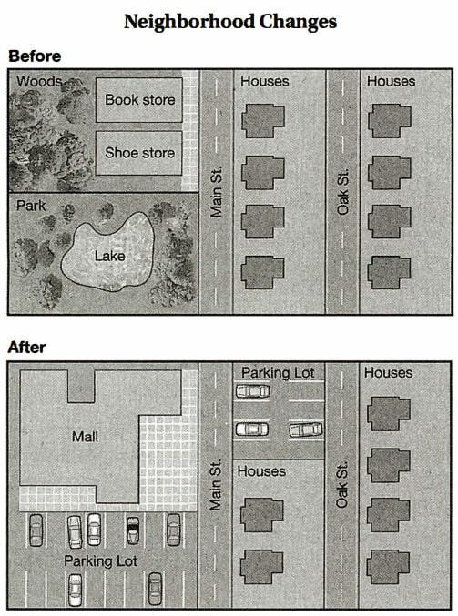
The diagram illustrates the changes before and following the building of Benfield Neighbourhood. Before the construction, there were many trees, a barn, and a cornfield, although many homes are built after it, and a new road is replaced by the fence.

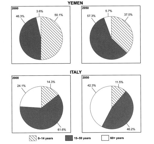
The diagrams illustrate some detail on the ages of the people of Yemen and Italy in 2000 also projections for 2050. The biggest amount of population in Yemen was the 15-year-old by almost 50%; however, it is expected the higher range will be 15-59-years people in 2050. Italy's 15-59 years population was approximately 61 per cent and this amount will be the biggest one in 2050 too.

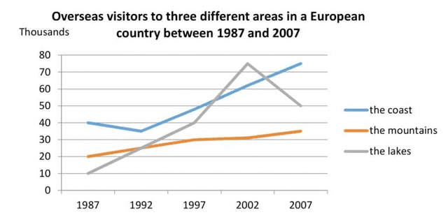
The given line graph illustrates how many travelers visited European countries' three particular places from 1987 to 2007.

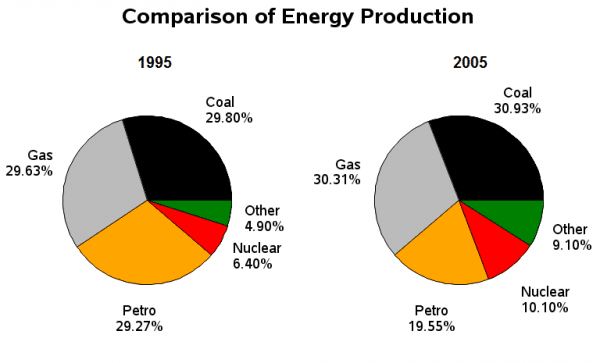
"The given two pie charts provide data on the comparison of five different types of energy generated in France from 1995 to 2005.

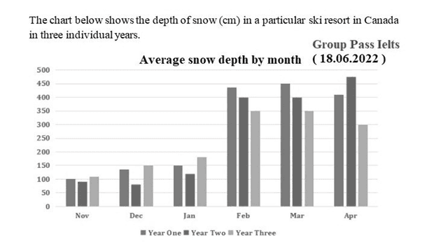
The given chart provides information on centimetres of snow laid in specific ski areas in Canada in three particular years from November to April.

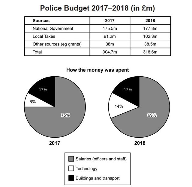
The data depicts how the police in one area of the UK manage their budget, by describing the sources of income and categories of expenses in 2017 and 2018. Overall, the police budget had increased during the period. Even though the general trend of the expenses remained the same, the priorities were changed slightly.

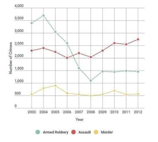
The multiple-line chart illustrates the trend of the three most dangerous crimes, such as armed robbery, assault, and murder in London over 9 years, between 2003 and 2012.

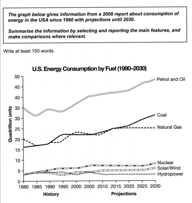
The provided line chart illustrates the consumption and projected trends of six different energy sources in the USA from 1980 to 2030. Notably, fossil fuels exhibit significant fluctuations, while renewable energy sources demonstrate relatively stable patterns. It is striking to note that petroleum and oil dominate energy consumption in the USA.

The multiple bar chart illustrates the sales of four types of books within a decade. The book types include hobby, entertainment, history, and art.

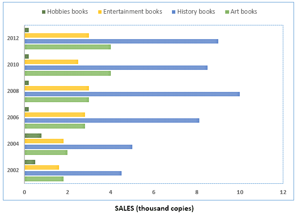
The given bar chart illustrates the distribution of books sold across four different text categories in terms of thousand unit replica profitable between 2002 and 2012.

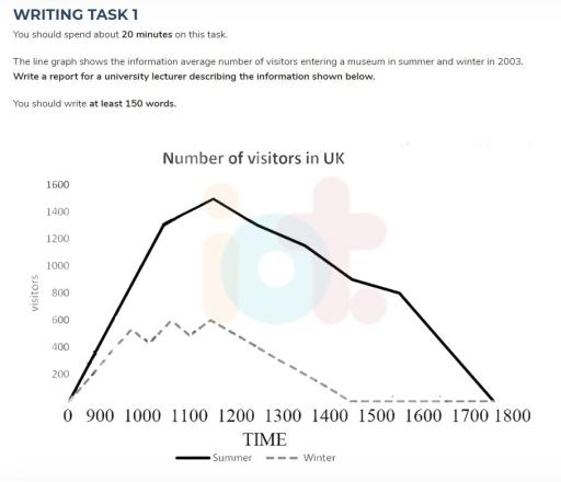
The line chart below displays the data of the average number of people who visited a museum during both summer and winter in 2003

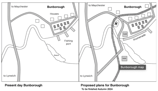
The two maps illustrate a masterplan of Bunborough Village nowadays and a proposed plan for 2024. Overall, it can be seen that several facilities and infrastructures, such as a railway, train station, and hotel, will be constructed in the village.

The figures illustrate the financial allocation of the British Police between 2017 and 2018. The table shows the list of income, whereas the pie chart compares the expenditure.

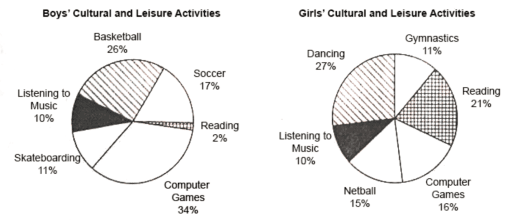
The presented pie charts depict the differences between boys' and girls' cultural and leisure activities. Overall, it can be observed that there is a huge difference between both of these genders when it comes to playing computer games and reading. Girls prefer to read books than playing computer games whereas, boys are opposite when it comes to this trend.


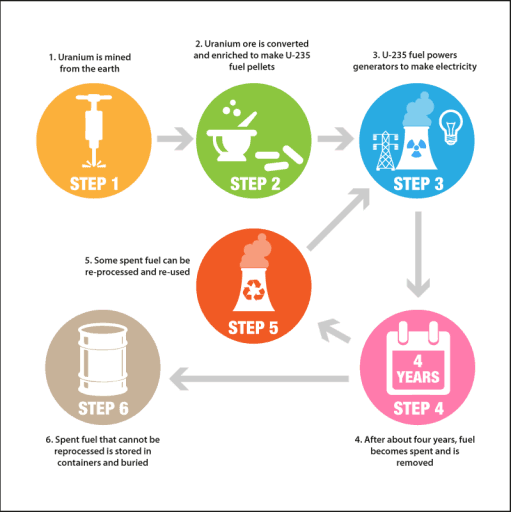
The provided graphic illustration depicts how uranium is utilized in the manufacture of nuclear energy.


8.5
band
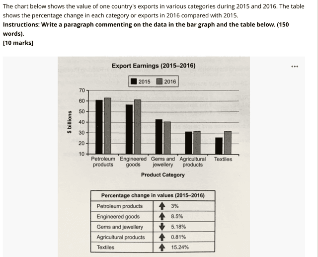
The bar graph depicts data about the exportation revenues in two years (2015 and 2016) of products that were classified into five categories, namely petroleum products, engineered goods, gems and jewellry, agricultural products and textiles. Besides, the table describes the difference in earnings between the two years aforementioned, measured in percentage.


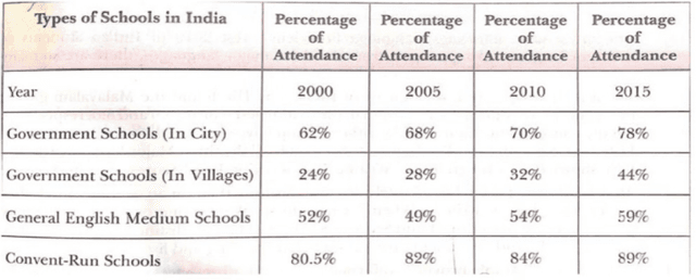
The table compares the percentage of students that attended different types of schools in India every 5 years, from 2000 to 2015.

8
band
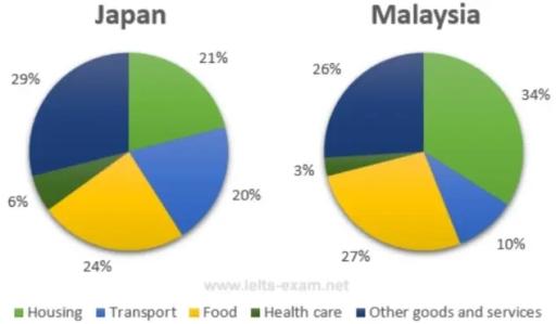
The provided pie charts compare the mean household expenses in Japan and Malaysia in the year 2010.


The given pie charts illustrates data around a participation rates in Cultural and Leisure activities after the survey , according to boys and girls into six main categories.

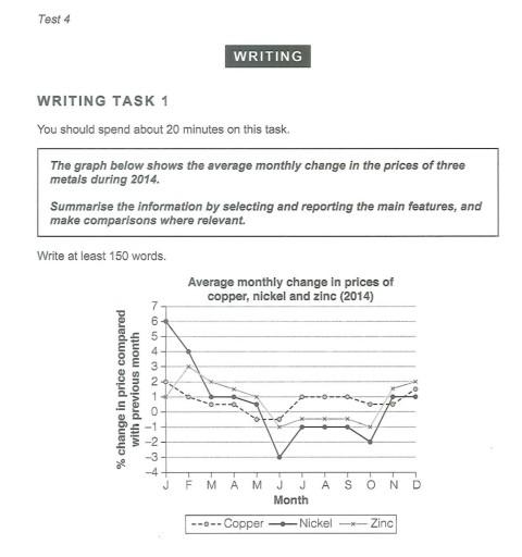
The line chart illustrates the average price variations of three different metals in 2014.


7.5
band
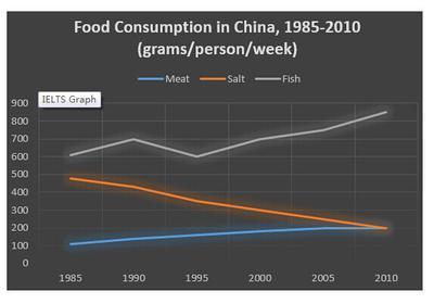
The line graph provides key information about the change in behaviour by Chinese individuals in food consumption over the period of 30 years from 1985 to 2010. The units are measured in the figure.

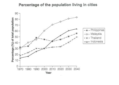
The line chart provides a key information about the percentage of the citizens in four cities Philippines, Malaysia, Thailand and Indonesia from 1970 to 2040. The data are mesuard in percentage of total people.


The line chart represent the information about the percentage of the population in four Asian countries living in cities from 1970 to 2020, with expected population for 2030 and 2040.I will discuss about this statement in the following paragraphs in detail.

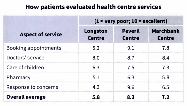
The table gives information about how patients evaluated various Healthcare care aspects at 3 different centres.

The line graph delineates the percentage of people in Malaysia, Thailand, Indonesia, and the Philippines living in the city between 1970-2020 and predicates their population in 2040.

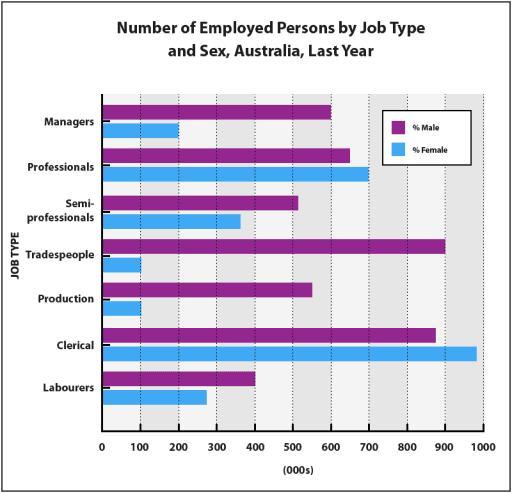
The bar chart represents the information related to the number of male and female workers in different professions in Australia in the previous year. Overall, what stands out from the figure is that the majority of the workers are males.

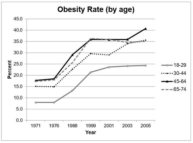
The line graph shows the obesity rate (by age) of one country between 1971-2005.

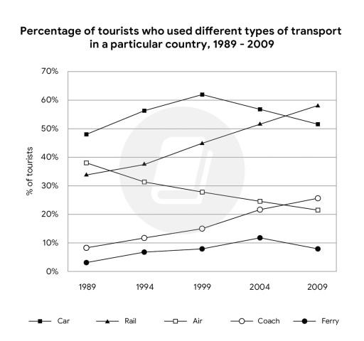
The given line graph illustrates the proportion of travelers who used the various types of transport in a specific country from 1989 to 2009. More than one type of transport may have been used by each tourist.
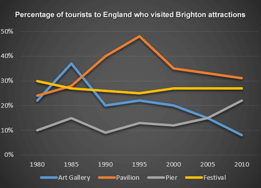
The line graph displays the ratio of tourists in England who went to the Brighton landmarks between 1980 and 2010 with a five-year gap.

The diagrams illustrate information about reading in people below 30 years of age.

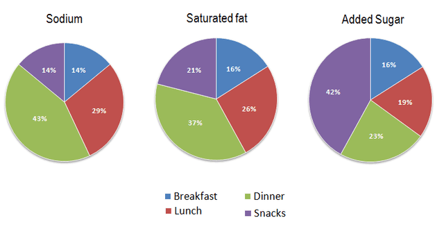
The pie chart below illustrates the medium percentage in ordinary meals of three types of nutrients, all of which may have bad effect on your helath if you eat too much.

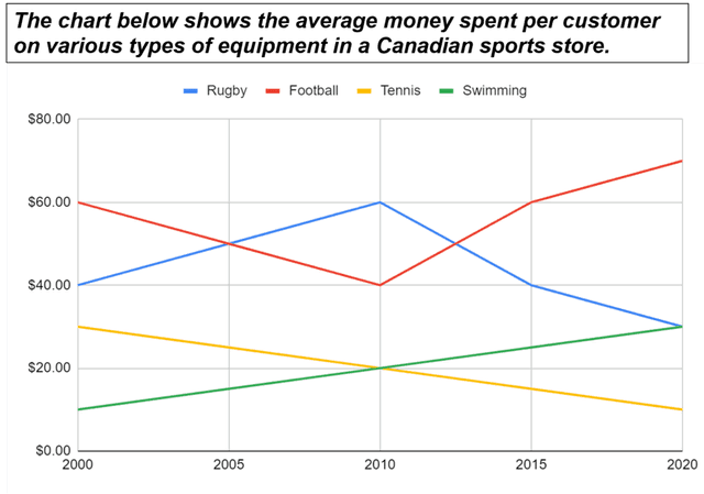
The line chart indicates the average money spent by each customer on equipment for various sports in a sports shop in Canada between 2000 and 2020.

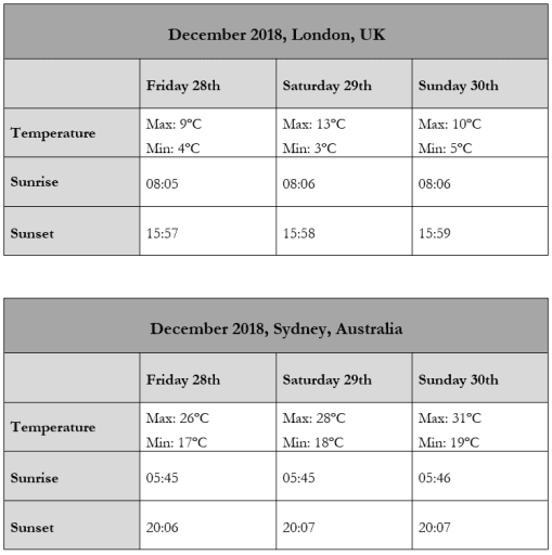
The provided tables depict the temperature and daylight hours during the weekend of December 28th to 30th, 2018, in Sydney, Australia, and London, UK.

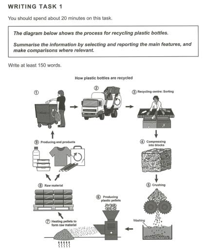
The diagram below gives the process of recycling plastic bottles.

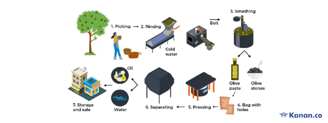
The process diagram below displays the cycle of producing olive oil.

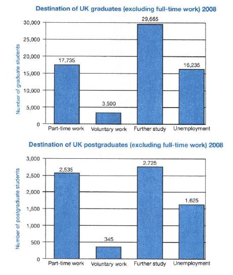
The graphs provide data about what the UK graduate and postgraduate students did after graduated from school in 2008 that they did not participate in full-time jobs.

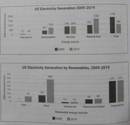
The given bar charts represents billions of kilowatt electricity per hours generated by energy sources and renewable energy sources in the US in 2009 and 2019

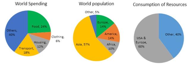
The pie charts present data on how various countries spent and consumed of resources and inhabitants is dispensed.


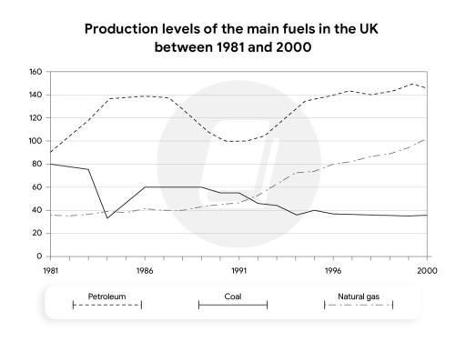
The line graph illustrates the production of three main kinds of fuel in the great Britian in the past nineteen years. An increase can be seen in petroleum production during the two decdaes while a decrease can be noticied in coal production one of the most important fossil fuels.

The given graph provides information about a number of people residing in cities of Phillipoiness, Malaysia, Thailand and Indonesia from the past to the forecasted future in persentagewise.
5.5
band
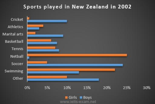
The bar chart illustrates the percentage of most famous sports played by girls and boys in the year 2002 in New Zealand. It can be interpreted that Netball is the favourite game of girls and on contrary boys are least interested in that while they spend their time playing Soccer.

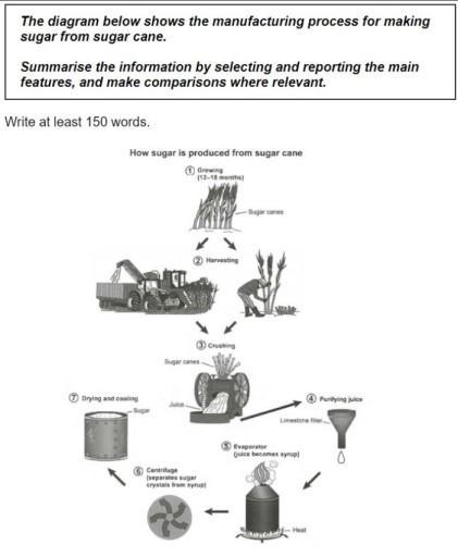
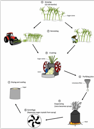
The process diagram illustrates the stages involved in producing sugar from sugar canes.

The charts illustrate the participation percantage for both boys and girls on various kind of activities, related to cultural and leisure. Overall, the two groups show a diverse interest in the games, while boys are more interested in outdoor activites, but girls prefer more indoor one.
The diagram illustrates the process of how sugar canes be converted into sugar.

The chart illustrates the prices of three different metals and how they changed monthly during 2014.
6
band
The charts illustrate how households in Malaysia and Japan spent their money on five different categories in 2010.
The provided bar chart illustrates the frequency of fast-food consumption among individuals in the USA over a decade, from 2003 to 2013.

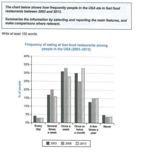
The bar chart illustrate , how often American's consumed fast food in restaurants over a period of 10 years between 2003 and 2013.

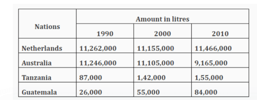
The given table illustrates how much milk was consumed annually between 1990 and 2010 in four countries, Netherlands, Australia, Tanzania and Guatemala.


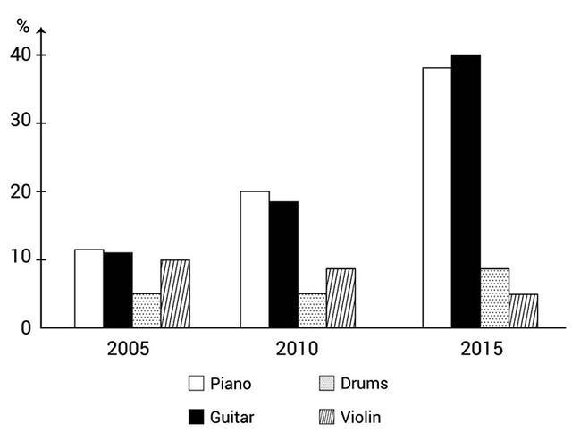
The bar chart illustrates the proportion of school children who learn to play four different musical instruments in three different years, 2005, 2010, and 2015. Overall, piano and guitar experienced considerable increases while violin fell during the given years.


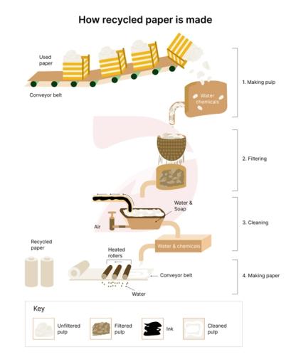
The diagram illustrates the process of making paper from pine trees and the cycle of paper recycling.

The bar chart illustrates the proportion of four types of musical instruments comprising piano, drum, guitar and violin with five-year intervals from 2005 to 2015.
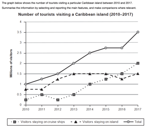
The given line graph illustrates how many visitors visited a particular caribbean island from 2010 to 2017.


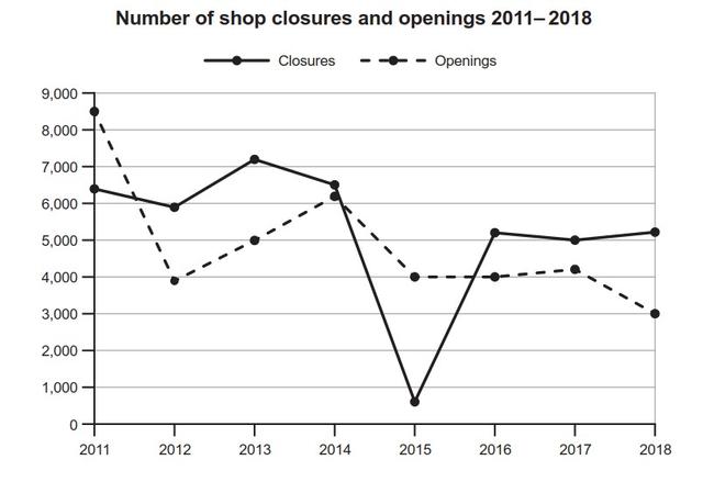
The line graph illustrates a number of opened and closed shops in one nation between 2011 and 2018.Shops are measured in thousands .

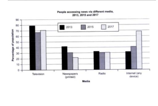
The bar chart illustrates the proportion of four different media used by individuals to access news in one country in three years comprising 2013, 2015 and 2017.

The table depicted below illustrates how much milk was produced by 4 different countries including Netherlands, Australia, Tanzania, and Guatemala over a period of 20 years. Units are meatured in liters.
7.5
band
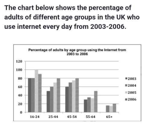
The bar chart illustrates the fraction of people in five different age groups using the internet from 2003 to 2006.

The bar chart represents the export earings of the year 2015 and 2016 and other chart shows the percentage change in values for the year 201 and 2016.I will explain in the following paragraphs.
The line graph represents the average carbondioxide emissions per person for the years 1967 - 2017. I will explain about this in the following paragraphs.


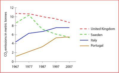
The line graph illustrates the average carbon dioxide emissions individual citizens in the Britain , Sweden , Italy as well as in Portugal from 1967 to 2007 .
The graph represents the number of tourists visting a particular Caribbean island in the year 2010 to 2017. I will explain about this chart in the following paragaphs.
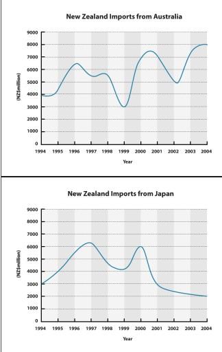
The provided diagrams depict New Zealand importation from both Australia and Japan in 10 years from 1994 to 2004.

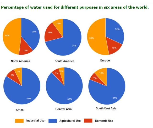
The pie charts illustrate data about the usage of water in 6 regions, which are North America, South America, Europe, Africa, Central Asia, and South East Asia, in precise precents.

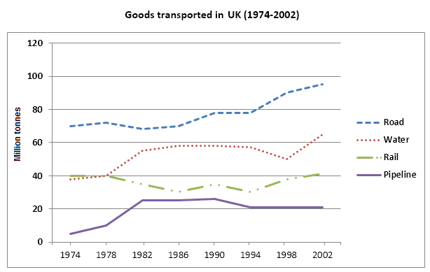
The graph displays the transported amount of goods in the UK from 1974 to 2002 by four various transportation methods.

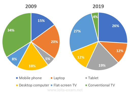
The pie chart displays the technological gadgets which people used the watch television age of between 18 and 25 in Canada in 2009 and 2019.

The pie charts illustrate the allocation of resources by countries and the distribution of global population.
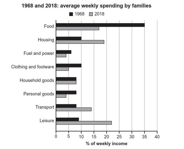
The table chart compares the weekly expenditure of families in one nation in terms of different items in 1968 and 2018.


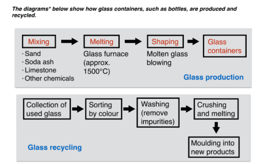
The diagram illustrates the process of making glass containers and recycling used bottles.

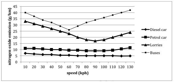
The line graph gives information about four fuel shaped vehicles produced the nitrogen oxide emissions.

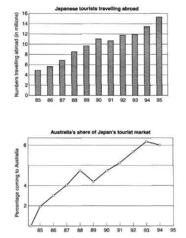
The given chart illustrates the quantity of Japanese tourists' journeys in the time period of from 1980 to 1995, in addition, the line graph indicates the number of those abroad trips that were made to Australia between 1985 and 1994.

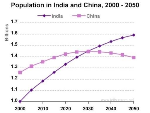
The figure below depicts the trend regarding the population growth of India and China in the first half of the 21st century.

The chart illustrates the rate of families using different types of technological gadgets in the U.S. between 1995 to 1999. It can be seen that people prefer these 5 main features to use technology in their homes.

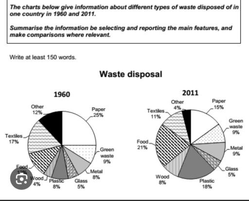
The chart illustrates the proportion of a variety of waste that is being disposed of in one country between 1960 and 2011.

The given bar graph provides data on the average daily sales of different five food, namely hot coffee, iced coffee, ice cream, soup and salad at the Birsk cafe by winter and summer.

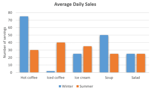
The bar chart compares of Brisk Café's 5 different kinds of food such as hot coffee, iced coffee, ice cream, and soup and salad of their sales in winter and summer. Overall, it is clear that hot coffee is far higher than the other foods in winter while iced coffee is slightly higher than others in summer.

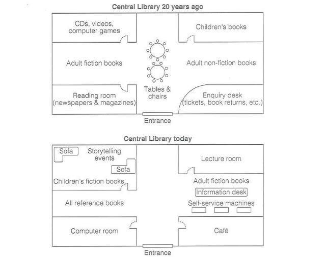
The maps illustrate plan for floor in a particular public library about 20 years and latest development.

The graph illustrates the number of seals, whales and dolphins listed in the Gormez straits between 2006 and 2018. They had a proportion between below the 20 and over fifty species in this chart.

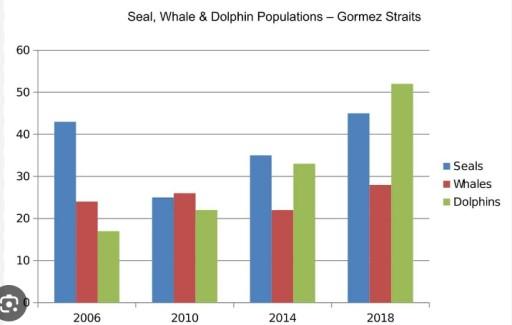
The bar chart illustrates the number of imprimatur, mammals and dolphins in Gormes Strait between 2006 and 2018.

7.5
band
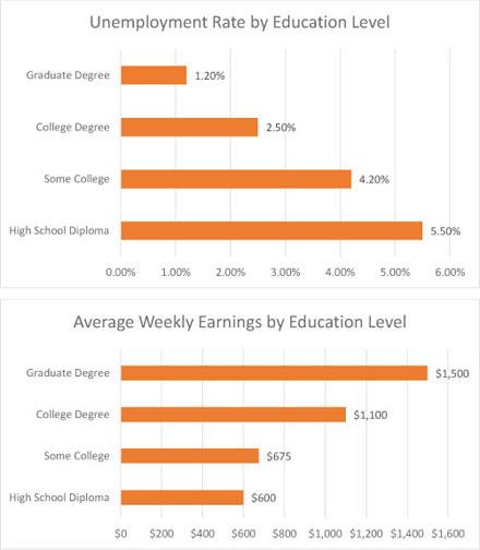
The bar charts compare the unemployment rate and the average weekly income of different levels of education. It is clear that the figure for people who had high school diplomas had a high unemployment rate. In addition, the salary of people who had graduate degrees was higher than other certificate holders.

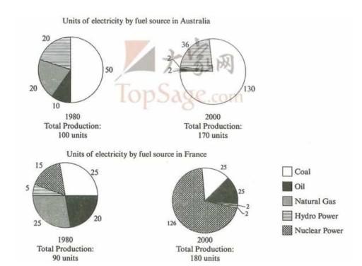
The give pie charts display the electricity generation from different fuel sources in separate years, 1980 and 2000. Overall, in both countries, total production increased significantly. Moreover, in Australia, coal had the highest portion among other fuel sources in both years, while in France the main source of electricity was allocated to natural power in 2000.


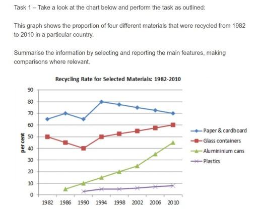
The above line chart depicted the recycling percentage of four different materials from 1982 to 2010 in a selected country.

The given pie charts display the electricity generation from different fuel sources in separate years, 1980 and 2000. Overall, in the both countries, total production increased significantly. Moreover, in Australia, coal had the highest portion among other fuel sources in both years, while in the France the main source of electricity was allocated to natural power in 2000.
The chart illustrates information about the proportion of musical instruments among school children who are learning in the years 2005, 2010 and 2015.

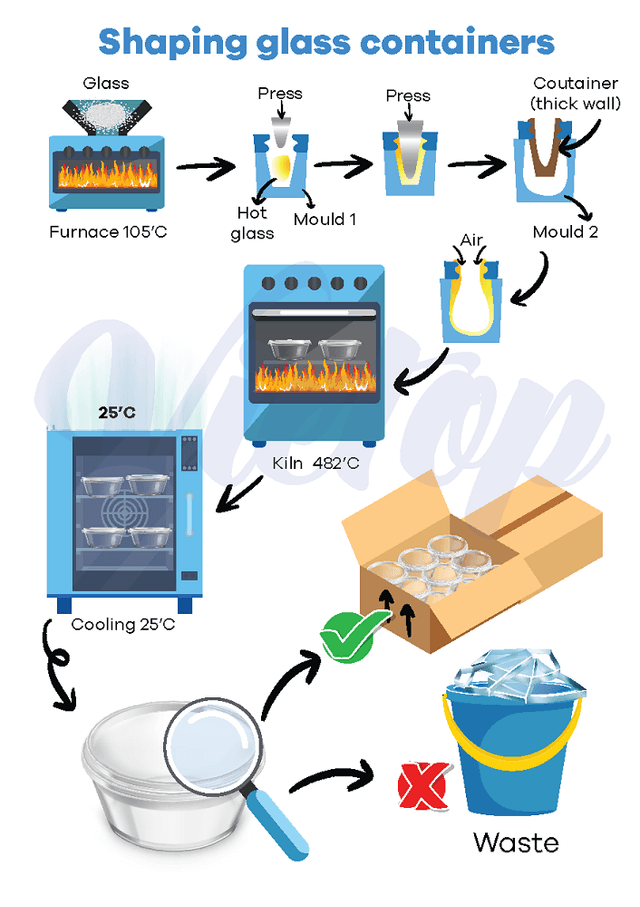
The diagram illustrates the process of moulding glass containers.

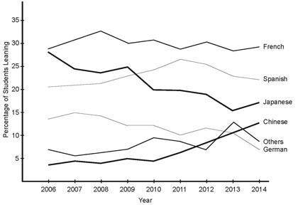
The line graph provides information about the percentage of New Zealand primary school students who had been learning a foreign language by language learned, between 2006 and 2014.

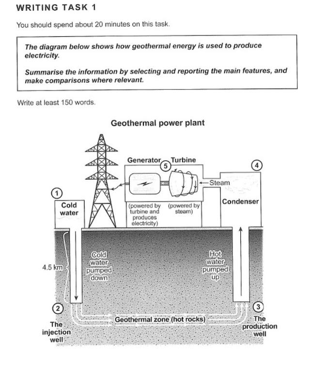
The diagram illustrated how geothermal energy is used to produce electricity. It was called "Geothermal power plant" which produced eectricity in the past, but do not use this progression at the moment.

The pie charts below provide the information about the proportion of total bills on four different kinds of expenditure by students in a particular country in Europe between 1985 and 2015. Overall, the figures for expenditure on the food, rent and clothes increased, while that for entertainment decreased.

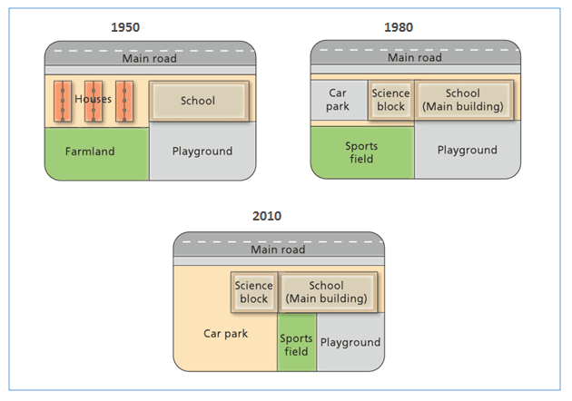
The three plans show changes to the West Park Secondary School since it was constructed in 1950. In the beginning, the territory was divided in four main units consisting of the school building, the playground, the farmland and three main houses.

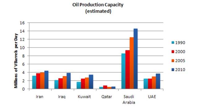
The given bar chart illustrates of ability oil production for many countries in Middle East from 1990 to 2010.

The graph shows data about the number of families in one country who spent their weekly income in 1968 and in 2018.
5.5
band
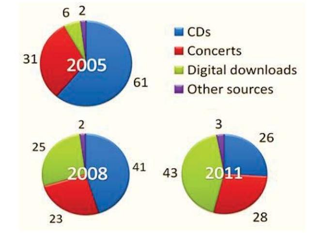
The pie charts depict consumers expenditure on four different of music soursec namely CDs, concerts,digital downloaded music and others.In three separate years in the Northern Ireland.

The given bar chart illustrates the comparison of people's living costs in different parts. The graph shows the expense of living in eight items, including food, housing and leisure. Generally, the expense of food, fuel and power, clothing and footwear as well as personal goods were decreased. On the other hand, the cost of housing, transport and leisure increased except for household goods which remained stable.

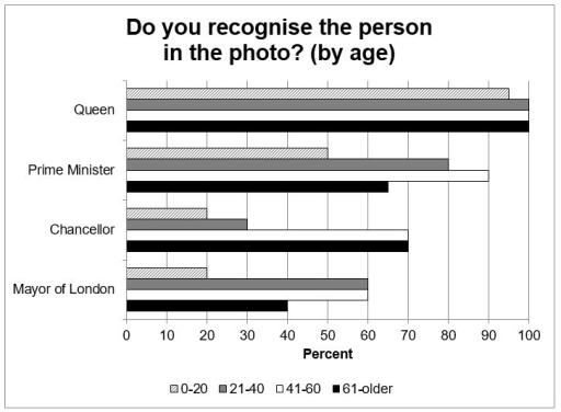
The chart illustrates the percentage of people by age range, who are able to identify British celebrities from pictures.
6.5
band
The provided line graph details figures for citizens living in 4 different countries on percentages between 1970 and 2040.

The diagram depicts the process that how uranium is used in the production of nuclear power.
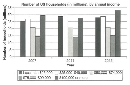
This bar chart depicts how much households earned per year, in the USA, in 2007, 2011 and 2015.

🚀 Prepare for IELTS writing section today!
- Unlimited Task 1 checksGet all the feedback you need to keep improving your charts and letters.
- Unlimited Task 2 checksPractice and perfect your skills with essays.
- Personalized suggestionsKnow how to boost your score.
- Detailed mistakes analysisGet instant feedback. Spot every mistake.
- Topic ideas generatorGet topic-specific ideas to enhance your writing.
- Vocabulary helperGet the right words for any topic.
- Progress trackingTrack your writing improvements.