The pie charts below give data on the spending and consumption of resources by countries and how the population is distributed.

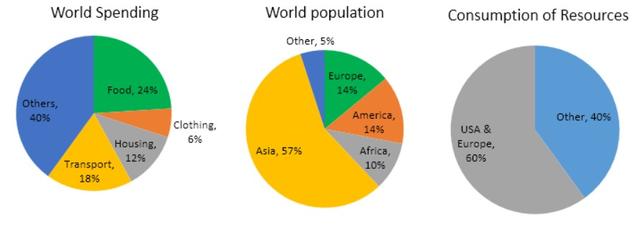
The pie charts illustrate the allocation of resources by countries and the distribution of
global
Correct article usage
the global
population
.
The data depicts how different countries spend resources, the distribution of the world
population
, and the consumption of resources by various regions.
The charts reveal that Asia makes up the majority of the world
population
at 57%, while
Europe and the USA account for 60% of resource consumption. Europe and America each represent 14% of the world
's population
, with Africa and other regions comprising 10% and 5% respectively. The USA and Europe together constitute the largest share (60%) of resource consumption, surpassing the combined share of other regions at 40%.
In terms of spending, food, housing, and transport collectively represent just over half of global expenditure. The clothing sector contributes nearly a quarter of total spending, with the rest attributed to other categories. Notably, other sectors account for a significant portion of world
spending.Submitted by quluzadenurlan107 on
Unauthorized use and/or duplication of this material without express and written permission from this site’s author and/or owner is strictly prohibited. Excerpts and links may be used, provided that full and clear credit is given to Writing9 with appropriate and specific direction to the original content.
Sentences: Add more complex sentences.
▼
Linking words: Add more linking words.
▼
Vocabulary: Replace the words population, world with synonyms.
▼
Vocabulary: The word "charts" was used 2 times.
▼
Vocabulary: The word "represent" was used 2 times.
▼