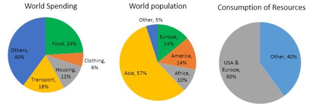
The pie charts below give data on the spending and consumption of resources by countries and how the population is distributed

The pie charts present data on how various countries spent and consumed
of
resources and inhabitants is dispensed.
Change preposition
apply
Overall
, the chart
shows that Asia was the most significant part of the world population chart
and the USA and Europe accounted for three-fifths of the consumption of resources chart
. On the other hand
, was the least significant fraction of the chart
of spending.
According to
the chart
, Europe and America share the same proportion . Both of them made up 14 per cent of the population’s chart
. Africa and other countries constituted 10% and 5% of the population’s chart
, respectively . America and Europe constituted 60% of the consumption of resources chart
; however
,merely two-fifths of the total consumption was derived from others.
Turning to the world spending , food, housing and transport comprised slightly above 50 per cent of spending , collectively .In contrast
, nearly a quarter of the total spending comes from the clothing sector and others were responsible for the biggest part of the proportion in the spending chart
Submitted by quluzadenurlan107 on
Unauthorized use and/or duplication of this material without express and written permission from this site’s author and/or owner is strictly prohibited. Excerpts and links may be used, provided that full and clear credit is given to Writing9 with appropriate and specific direction to the original content.
Vocabulary: Replace the words chart with synonyms.
▼
Vocabulary: Rephrase the word "data" in your introduction.
▼
Vocabulary: The word "charts" was used 10 times.
▼
Vocabulary: The word "proportion" was used 2 times.
▼
Vocabulary: The word "significant" was used 2 times.
▼